Horizontal & Vertical Slider Direction
The Before & After Slider widget features the option to create horizontal or vertical sliders for your Ready Mag website, enabling you to unleash the full power of your creativity.

With the Before & After Slider, you can increase engagement on your Ready Mag website by offering an interactive feature for your users to interact with. More engagement increases interest and, subsequently, improves the decision-making process that will convert curious visitors into paying customers.
You can use the Before & After Slider widget to tell a compelling story by using the right images. Present the effects of global warming on nature, demonstrate the powerful transformations of people, present the results of interesting item restoration, and much more!
You can showcase your product or service benefits using this Before & After Slider by comparing the changes side-by-side. Show how you’ve restored a mouthful of crooked teeth, or how your product has cleaned the same item, only better, or how you’ve restored a decrepit house into a glorious abode — the options are limitless!
The Before & After Slider widget features the option to create horizontal or vertical sliders for your Ready Mag website, enabling you to unleash the full power of your creativity.

If you use the Before & After Slider widget, you can create multiple sliders to tell your story however you want.

You can customize the Be widget so that it fits your needs exactly. Change colors, fonts, spacing, and anything else you like.

The Be widget is easy to use and requires no coding knowledge. The intuitive dashboard with drag-and-drop functionality will allow you to customize the widget in any way you'd like with just a few clicks.
The Be widget is 100% responsive and will look wonderful on any device. With this feature, you will be able to stay ahead of your competitors in a mobile-first world.

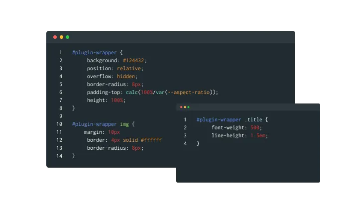
As with all of Common Ninja’s widgets, you can add custom CSS to customize the Be widget and be even more creative.

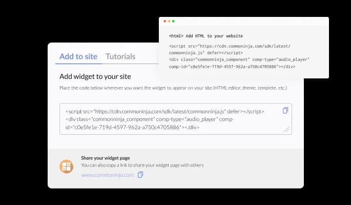
A single line of code allows you to embed the Be widget on your Ready Mag website. With every change you make, the widget will be automatically updated.
