Try for free!
CMS Max

Before & After Slider for CMS Max

Captivate Users With Interactive Before & After Images

Create a Slider
  • Matthew Brown
  • Sam Taylor
  • Madison Reed
  • Daniel Levy

loved by 500k+ businesses

Before & After Slider for CMS MaxBefore & After Slider for CMS Max settingsBefore & After Slider for CMS Max design
Marcela Soto, ReasonWhy

Marcela Soto, ReasonWhy

"Kudos to the Common Ninja team for delivering both an outstanding product and excellent customer service. I highly recommend them to anyone looking for a top-notch solution!"

Roberto Sterza, KRENDALL srl

Roberto Sterza, KRENDALL srl

"Support it's incredible: I have sent an email about a bug and the SAME day I got the fix. Outstanding support and amazing widgets!!!!!!!!!!"

Desert Barbell

Desert Barbell

"Yes yes yes. We were able to consolidate a lot of our web features through one service and one subscription. Lowered the cost of our site, looks and works great."

Why Should You Use the Before & After Slider Widget ?

Improve Engagement Through Interaction on your CMS Max store

With the Before & After Slider, you can provide an interactive feature for your users to interact with on your CMS Max store. More engagement increases interest and, subsequently, improves the decision-making process that will convert curious visitors into paying customers.

Creating compelling visual stories with Before & After Slider

With the Before & After Slider for CMS Max, you can convey a compelling story by using the right images. Display the changes global warming causes in nature, exhibit the powerful transformations of people, showcase the results of items being restored and much more!

Presenting your showcase effectively

The Before & After for CMS Max allows you to showcase the benefits of your product or service in the most effective way — visual, side-by-side comparison. The examples are endless! How you fixed a mouthful of crooked teeth, how your product cleaned the same item better, or how you turned a crumbling house into a shining gem - the possibilities are endless!

Horizontal & Vertical Slider Direction

With Before & After Slider for CMS Max, you can create horizontal or vertical sliders for your CMS Max store, thus unleashing the creative potential of your site. You will have the freedom to customize your add-on to meet the demands of your project thanks to the choice of creating either horizontal or vertical sliders. Whether you're a designer, photographer, or business owner, the CMS Max Before & After Slider add-on is the perfect tool to help you showcase your work uniquely and engagingly.

Before & After Slider - Horizontal & Vertical Slider Direction

Showcase Multiple Before & After Sliders

If you use the Before & After Slider add-on, you can create multiple sliders to display on your CMS Max store and tell your story however you want. Whether you want to showcase the progression of a construction project, the transformation of a home renovation, or the change in the appearance of a person or animal over time.

Before & After Slider - Showcase Multiple Before & After Sliders

Fully Customizable add-on

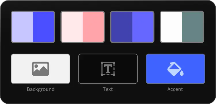
The Before & After Slider add-on for CMS Max features full customization options so you can edit the design to fit your CMS Max store needs. You can change the colors of the slider, buttons, and labels to match your branding. You can also choose from different font options and adjust the font size, style, and color to create a cohesive and professional look. In addition to these design options, you can also customize the spacing of the add-on to ensure it fits seamlessly into your CMS Max store layout.

Before & After Slider - Fully Customizable add-on
Before & After Slider - A breeze to use add-on

A breeze to use add-on

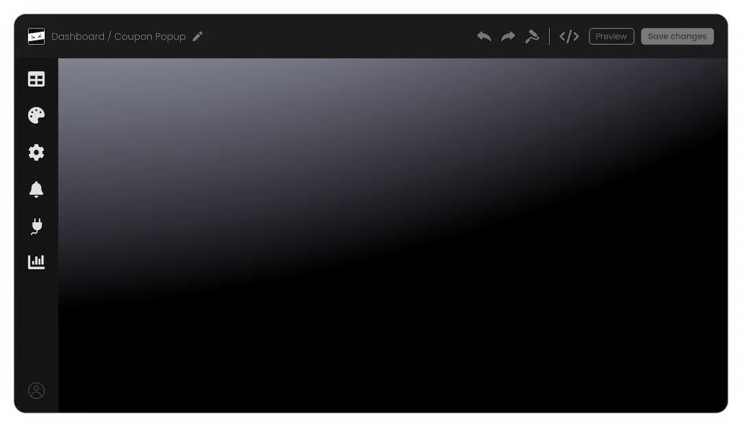
Before & After Slider for CMS Max do not require any coding knowledge. Our intuitive dashboard with the drag-and-drop feature will enable you to customize the add-on any way you’d like to with just a few simple clicks.

Before & After Slider - Label's Placement

Label's Placement

You have the ability to adjust the positioning of the labels on the CMS Max Before and After Slider add-on. This gives you the option to alter the labels' placement so that it best complements the look and feel of your CMS Max store.

Before & After Slider - Set Image Ratio

Set Image Ratio

Regardless of whether your image is in the landscape, portrait, or square format, you have the ability to define the image ratio for optimal display.

Responsive Design for your CMS Max store

Any store can benefit from The Before & After for CMS Max. Not only is it fully responsive, meaning it will adjust seamlessly to fit the screen size of any device, but it also has a sleek and modern design that will enhance the overall look of your CMS Max store. Having a store that is optimized for mobile viewing is essential in a world where increasing numbers of people access the internet via their phones and tablets. You may achieve it with the help of the Before & After CMS Max add-on, which will give you an advantage over rivals.

Before & After Slider - Responsive Design for your CMS Max store

Before & After Slider CSS Customization

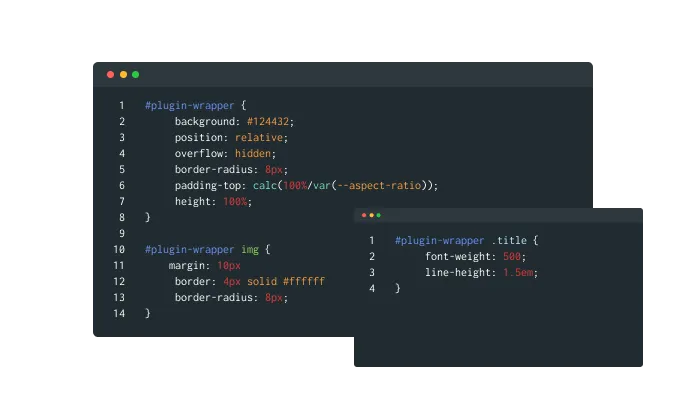
Custom CSS can also be used to further customize the Before & After Slider add-on for CMS Max in Common Ninja.

Before & After Slider - Before & After Slider CSS Customization

Embeds Easily On Your CMS Max store

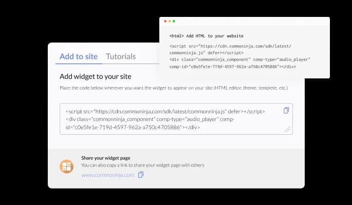
You can embed the Before & After Slider add-on for CMS Max on your CMS Max store easily by copying a single line of code. The CMS Max Be will also be updated automatically on your CMS Max store with every change you make.

Before & After Slider - Embeds Easily On Your CMS Max store

Trusted By

Billboard logoNBC logoPanasonic logoBlizzard logoPanasonic logoBytedance logoBarstool Sports logoFifa logoVox Media logoNATO logoCBC logowayfair logoAtlassian logoFandom logoBenq logoPWC logoPapaya logoQatar Airways logoNexon logoNexon logo

Why Should I Use Common Ninja's Widgets?

Reliable Support

We value our customers and offer top-notch support and quick reply times. You won’t be left hanging with a problem on your hands, we promise.

An Intuitive Editor

Our widgets come with a simple-to-use, intuitive editor that enables you to drag and drop elements within the widgets and edit them with absolute ease.

User Analytics Included

We add user analytics to each app so you can get valuable insights including the number of installations, impressions, views, engagement metrics and more!

Fully Customizable

Our widgets are fully customizable and offer a wide variety of design options for you to choose from. Fonts, colors, shapes, sizes and more — change any design element to fit your needs.

GDPR Compliant

We value your privacy and rights over personal data. To that end, all our widgets are GDPR and CCPA compliant to protect your privacy. You can learn more about our

Highly Secure

Our servers, code and API are constantly audited to make sure that our widgets are secure. We also reinforce this by creating widgets of high quality and by trusted developers.

Perfectly Responsive

Our widgets are fully responsive and will work on any device. In a mobile-first world, this feature gives you a strong advantage over competitors.

Continuous Improvement

We constantly work to improve our widgets and add new features and capabilities to them so that you can have everything you need at your fingertips.

No Coding Skills Required

Our widgets require absolutely no coding knowledge. Edit the app to your liking, copy its HTML code, and paste it where needed. That’s it.

FAQ

Compatible With All Site Builders, E-Commerce Platforms and Websites

webflow logoshopify logowix logowordpress logobigcommerce logosqurespace logoweebly logojoomla logoduda logojimdo logomagento logoshift4hsop logounbounce logocarrd logo
View all supported platforms