Infographics are powerful tools for conveying complex information in a clear, visually appealing format, but the most effective infographics do more than just display facts.
By using storytelling techniques, you can turn your infographic into a compelling narrative that guides the viewer through data in a meaningful way. Crafting a story with your visuals makes the information more memorable, engaging, and impactful.
This article will explore essential tips for designing infographics that tell a compelling story, helping you connect with your audience and make your data resonate.
Understanding the Power of Infographics
Infographics have become an essential tool in modern communication, combining visuals and data to convey complex information in a simplified and engaging format. They effectively capture attention, making them powerful assets in digital content strategies.
What Makes Infographics Effective
Infographics are effective because they present information visually, making data more accessible and memorable.
By using graphics, icons, and colors, infographics break down complex information into digestible visuals that are easier for audiences to understand at a glance. This visual approach appeals to a wide range of audiences, aiding retention and making key points stand out.
Research shows that people process visuals faster than text, which is why infographics are ideal for conveying statistics, processes, and comparisons.
The Role of Infographics in Modern Communication
In a digital landscape saturated with content, infographics help businesses and educators communicate effectively by standing out in feeds, emails, and presentations. They enhance engagement on social media, simplify reports, and support data-driven storytelling.
By combining visuals with concise messaging, infographics enable brands to communicate complex ideas clearly and compellingly, helping audiences quickly grasp essential insights.
Key Elements of a Compelling Infographic
Creating a compelling infographic requires more than attractive visuals; it demands a clear message, a logical structure, and effective data visualization.
These elements ensure that the infographic resonates with audiences and communicates its intended information effectively.
Clear and Focused Message
A strong infographic starts with a clear, focused message that aligns with the goals of your content.
Before diving into design, define the central purpose of the infographic — whether it’s to educate, inform, compare, or persuade. Keep the content concise and centered around a single idea or theme to avoid overwhelming viewers with too much information.
Use headings and subheadings to clarify sections, and let visuals highlight the key points, allowing viewers to quickly grasp the main message without sifting through excessive text.
Logical Flow of Information
The structure of an infographic should guide the viewer through the information in a logical and intuitive flow.
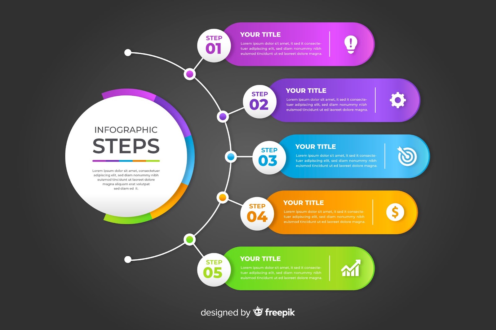
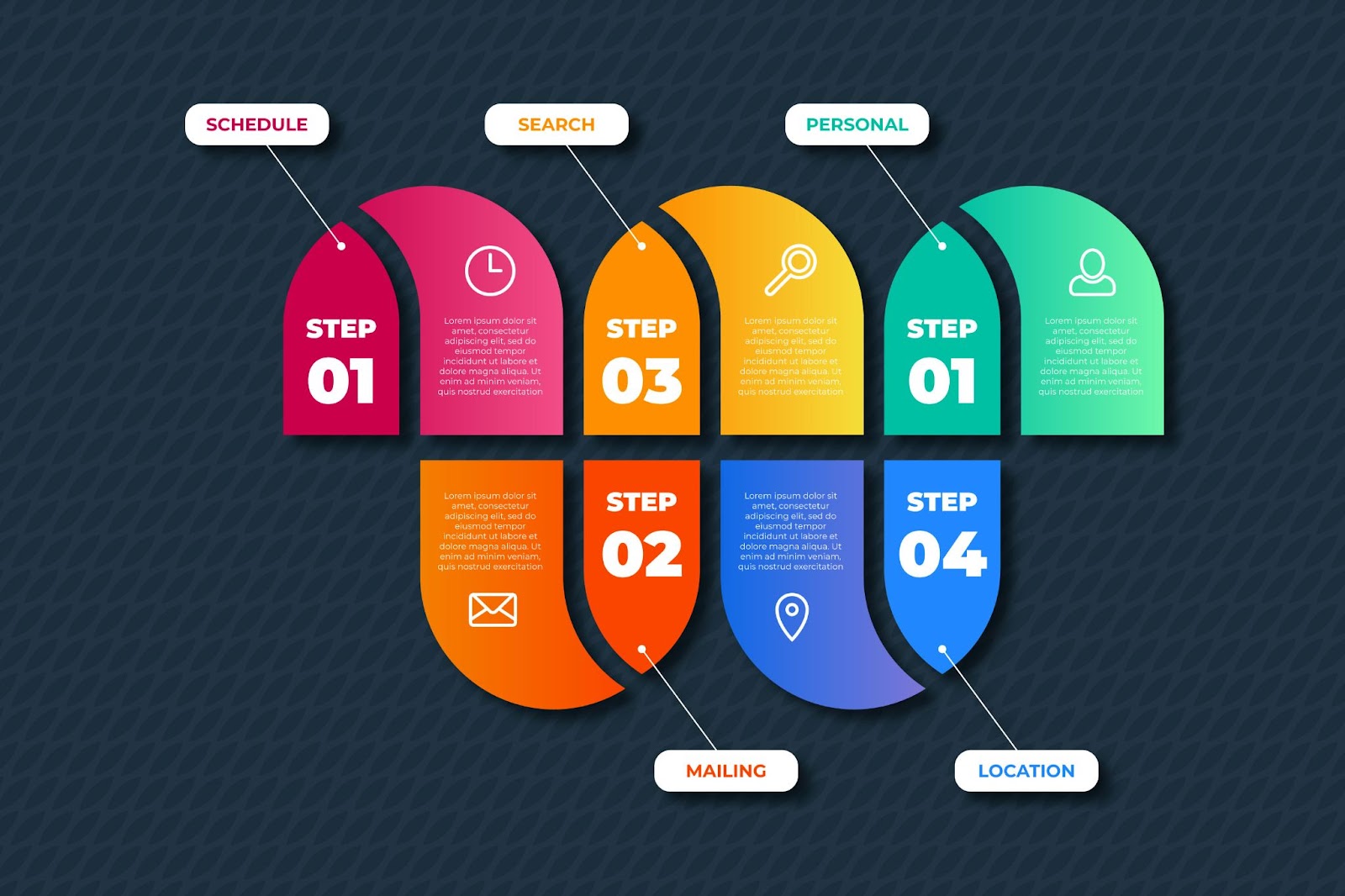
Organize the content in a way that builds a narrative, often progressing from general to specific or following a sequential process. Using numbered steps, directional arrows, or sections can help orient viewers, allowing them to follow the storyline naturally.
A well-organized layout ensures that the infographic is not only engaging but also easy to navigate, making complex topics easier to understand.
Data Visualization Techniques
Data visualization is at the heart of a successful infographic. Use charts, graphs, icons, and symbols to represent data clearly and visually, making it more digestible and memorable.
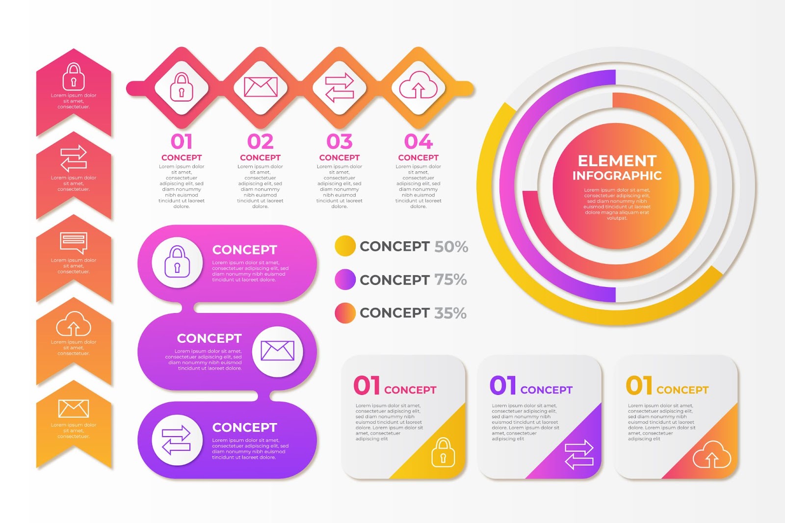
Choose visualization types that best suit the data: for example, bar charts work well for comparisons, pie charts are suitable for proportions, and timelines are ideal for sequential data.
Color coding, contrasting shades, and simple, legible fonts further enhance readability, drawing viewers’ attention to the most important numbers and facts. Avoid cluttering visuals; simplicity in design allows data to speak for itself.
Design Principles for Effective Infographics
Designing an effective infographic involves careful consideration of color, typography, and the balance between text and imagery. These design principles enhance visual appeal and readability, making the infographic more engaging and easy to understand.
Color Psychology and Usage
Color plays a significant role in conveying emotions and drawing attention to key elements in an infographic. Use color psychology to enhance the message—warm colors like red and orange can create urgency, while cool tones like blue and green suggest calmness and trustworthiness. Limit the color palette to a few complementary shades to maintain consistency and avoid overwhelming the viewer.
Use contrasting colors to highlight important information or data points, guiding the viewer’s eye toward the most essential parts of the infographic. Consistent color usage strengthens the infographic’s theme, making it visually cohesive and more impactful.
Typography and Readability
Typography directly affects readability, so it’s essential to choose fonts that are clear and legible at a glance. Use bold, sans-serif fonts for headings to ensure they stand out, while a simple, clean font works well for body text.
Maintain a hierarchy by varying font sizes for headings, subheadings, and main text, helping guide the viewer through the content flow. Limit the number of fonts to two or three to avoid clutter and keep the design professional.
Make sure text color contrasts with the background, and avoid placing text over busy images or patterns, as this can reduce readability.
Balance Between Text and Imagery
A successful infographic strikes the right balance between text and imagery. Use visuals like icons, charts, and illustrations to convey information without relying on excessive text. Keep sentences concise, using bullet points or short phrases when possible to prevent overcrowding.
Aim for a 50-50 balance between visuals and text, allowing images to reinforce the message without overshadowing it.
This balance creates an engaging visual experience that keeps viewers focused on the content, while the combination of images and minimal text ensures key points are easily understood and retained.
Tools and Software for Creating Infographics
A variety of tools and software are available for creating compelling infographics, ranging from beginner-friendly platforms to advanced design applications.
Choosing the right tool depends on your design experience and project requirements, and knowing how to maximize each tool can enhance your infographic creation process.
Overview of Popular Design Tools
Popular infographic design tools include Canva, Piktochart, and Adobe Illustrator. Canva and Piktochart are user-friendly, web-based platforms with a wide range of templates, icons, and easy drag-and-drop functionality, ideal for those with minimal design experience.
Both tools offer pre-made templates for quick customization, allowing you to create professional-looking infographics in minutes.
Adobe Illustrator, on the other hand, is a powerful design software preferred by experienced designers for its advanced customization options, vector capabilities, and precision.
Tips for Using Each Tool Effectively
For Canva and Piktochart, start by selecting a template that closely matches your vision, then adjust colors, fonts, and images to align with your brand. These tools are excellent for experimenting with layouts and design elements quickly.
For Adobe Illustrator, leverage vector shapes and precise alignment tools to create highly customized designs. Use Illustrator’s grid and guide features to ensure your layout is balanced and well-structured.
Learning a few shortcuts and familiarizing yourself with layer management can also speed up the design process.
Best Practices for Sharing and Promoting Infographics
To maximize the reach and impact of your infographics, it’s essential to optimize them for social media and search engines. Effective sharing and promotion can increase visibility, drive engagement, and enhance brand credibility.
Optimizing for Social Media
When sharing infographics on social media, consider platform-specific dimensions to ensure optimal display. For instance, Pinterest and Instagram favor vertical formats, while Facebook and Twitter perform better with horizontal or square images. Include a catchy caption and relevant hashtags to increase discoverability.
Additionally, break down larger infographics into smaller, shareable sections for platforms like Instagram Stories, making them easier to digest and more engaging for viewers.
SEO Best Practices for Infographics
To enhance search engine visibility, use descriptive file names and alt text for infographics that include targeted keywords. Host the infographic on a dedicated page with an optimized title, meta description, and relevant accompanying text.
Embedding a transcript or summary with keyword-rich content on the page can help search engines understand the infographic’s context, improving its chances of ranking in image and web search results.
Conclusion
In conclusion, designing infographics that tell a story is a highly effective way to make complex information accessible and engaging. This article has provided tips on using narrative elements, clear visuals, and logical flow to create infographics that captivate your audience and convey your message effectively.
By focusing on storytelling, you can transform your data into a memorable experience that not only informs but also inspires. A well-crafted infographic that tells a story can leave a lasting impact and elevate your content’s reach and effectiveness.


