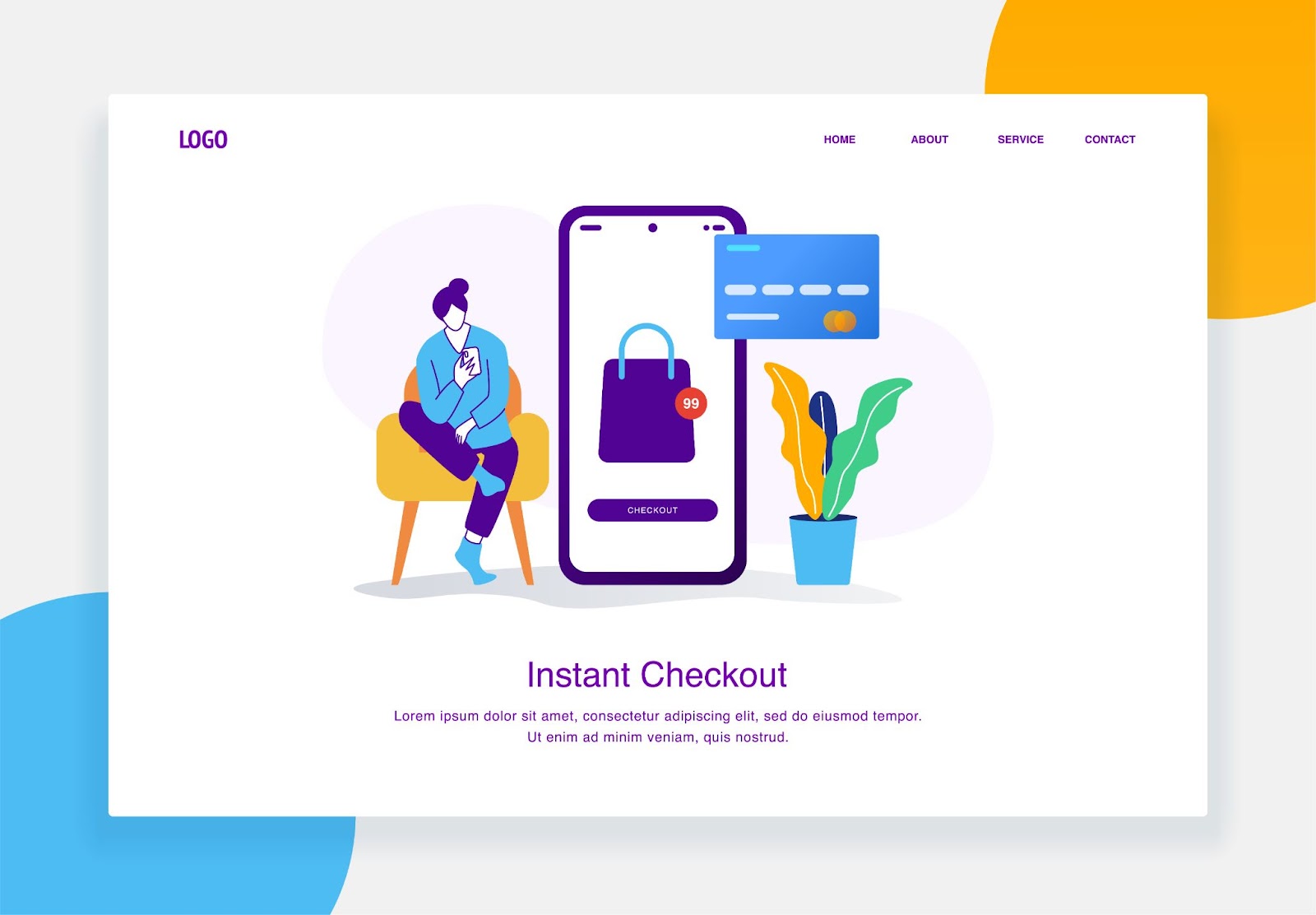
The checkout page is a critical point in the customer journey, where potential buyers decide whether to complete their purchase or abandon their cart. Even the slightest friction or confusion at this stage can lead to lost sales, making it essential to optimize the checkout process for a seamless and user-friendly experience.
Effective optimization involves streamlining the process, reducing distractions, and addressing customer concerns to encourage conversions.
This article will explore key strategies for optimizing checkout pages to boost conversion rates, ensuring that more visitors turn into satisfied customers.
Importance of Checkout Page Optimization
Optimizing the checkout page is crucial for enhancing user experience and maximizing sales. Its role in the sales funnel and its direct impact on conversion rates make it a critical focus for any e-commerce business.
Role in the Sales Funnel
The checkout page is the final step in the sales funnel, where potential customers transition from interest to purchase. This page's design and functionality can significantly influence whether a customer completes their purchase or abandons their cart.
A smooth, intuitive checkout process minimizes friction and ensures that customers can easily finalize their transactions, reducing the likelihood of cart abandonment.
Impact on Conversion Rates
An optimized checkout page directly impacts conversion rates by streamlining the purchasing process and addressing common user concerns.
Features such as a simplified form layout, multiple payment options, clear security assurances, and guest checkout can significantly increase the likelihood of completing a purchase.
By reducing barriers and enhancing the user experience at this critical stage, businesses can see a substantial improvement in their overall conversion rates, leading to increased revenue and customer satisfaction.
Key Elements of an Optimized Checkout Process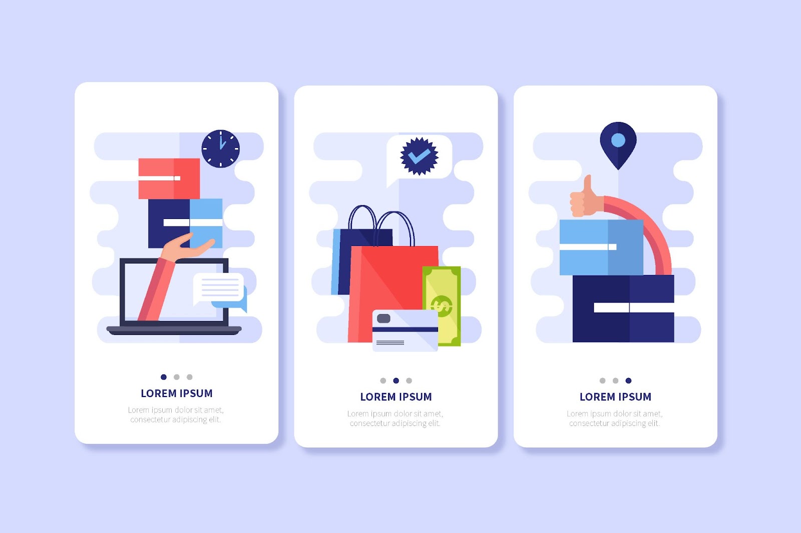
Optimizing the checkout process is essential for reducing cart abandonment and improving conversion rates.
Key elements include simplifying the checkout flow, minimizing required input fields, and providing multiple payment options.
Simplifying the Checkout Flow
A streamlined checkout flow is crucial for keeping customers engaged and reducing friction. Break the process into clear, manageable steps, preferably on a single page or in a simple, multi-step form with a progress indicator.
This approach helps users understand where they are in the process and what steps remain, reducing uncertainty and increasing the likelihood of completing the purchase.
Avoid unnecessary redirects and keep the interface clean and intuitive, with clear calls to action guiding the user seamlessly from one step to the next.
Minimizing Required Input Fields
Minimizing the number of required input fields is another critical factor in optimizing the checkout process.
Long, complicated forms can deter customers from completing their purchase. Instead, ask for only the essential information needed to process the transaction, such as shipping and payment details. Implement features like autofill, address lookup, and saved payment information to speed up the process.
Additionally, offering guest checkout options allows users to complete their purchase without the friction of creating an account, which can be a significant barrier for first-time customers.
Providing Multiple Payment Options
Offering multiple payment options caters to the diverse preferences of customers and enhances the checkout experience. In addition to standard credit and debit card payments, include options like PayPal, Apple Pay, Google Pay, and even alternative methods like buy now, pay later services.
Providing a variety of secure payment methods not only increases the convenience for users but also builds trust by accommodating their preferred method of payment.
Displaying security badges and ensuring that the payment process is smooth and reliable further reassures customers that their transactions are safe.
Design Considerations for Checkout Pages
Designing an effective checkout page is crucial for enhancing user experience and driving conversions.
Key design considerations include ensuring mobile responsiveness, incorporating trust signals and security badges, and using clear call-to-action buttons.
Mobile Responsiveness
With a growing number of consumers shopping on their mobile devices, ensuring that your checkout page is fully responsive is essential. A mobile-responsive design adapts seamlessly to different screen sizes, providing an intuitive and smooth experience regardless of the device.
This includes optimizing button sizes for touchscreens, using mobile-friendly input fields, and ensuring that the page loads quickly. A clutter-free design with easy navigation helps reduce friction, encouraging users to complete their purchases on mobile devices.
By prioritizing mobile responsiveness, you can cater to a significant portion of your audience and reduce cart abandonment rates among mobile shoppers.
Use of Trust Signals and Security Badges
Incorporating trust signals and security badges on the checkout page is critical for reassuring customers that their personal and payment information is secure. Displaying badges from recognized security providers like Norton, McAfee, or SSL certificates prominently can increase customer confidence.
Additionally, including trust seals from payment processors like Visa, Mastercard, or PayPal further reassures users. Testimonials, money-back guarantees, and clearly stated privacy policies can also serve as trust signals that build credibility and reduce hesitancy.
Ensuring that users feel safe and secure during the checkout process is key to minimizing cart abandonment.
Clear Call-to-Action Buttons
Clear and prominent call-to-action (CTA) buttons are essential for guiding users through the checkout process.
The primary CTA, such as "Place Order" or "Complete Purchase," should stand out visually, using contrasting colors and a size that makes it easy to click, especially on mobile devices.
The language should be concise and action-oriented, clearly indicating what will happen next. Position these buttons strategically so that they are easy to find at each step of the checkout process. Avoid clutter around CTAs to ensure users can easily identify and engage with them.
Addressing Cart Abandonment Issues
Cart abandonment is a common challenge in e-commerce, but it can be mitigated through targeted strategies like exit-intent popups and retargeting campaigns.
Exit-Intent Popups
Exit-intent popups are an effective tool for addressing cart abandonment by capturing the attention of users who are about to leave the site without completing their purchase.
These popups trigger when the user's cursor moves towards the browser's close button or address bar, indicating an intent to exit. The popup can offer incentives such as discounts, free shipping, or reminders about the items in their cart, encouraging them to reconsider their decision to abandon the purchase.
By providing a last-minute incentive or useful information, exit-intent popups can significantly reduce abandonment rates and recover lost sales.
Retargeting Strategies
Retargeting is another powerful method to re-engage customers who have abandoned their carts. By using cookies to track users who left without completing their purchase, businesses can deliver personalized ads across various platforms, such as social media and display networks.
These ads can remind customers of the items left in their cart, offer special promotions, or provide additional reasons to return and complete the purchase. Retargeting keeps your brand and products top of mind, increasing the likelihood that the customer will return to your site and finalize their transaction.
Analytical Tools to Measure Checkout Efficiency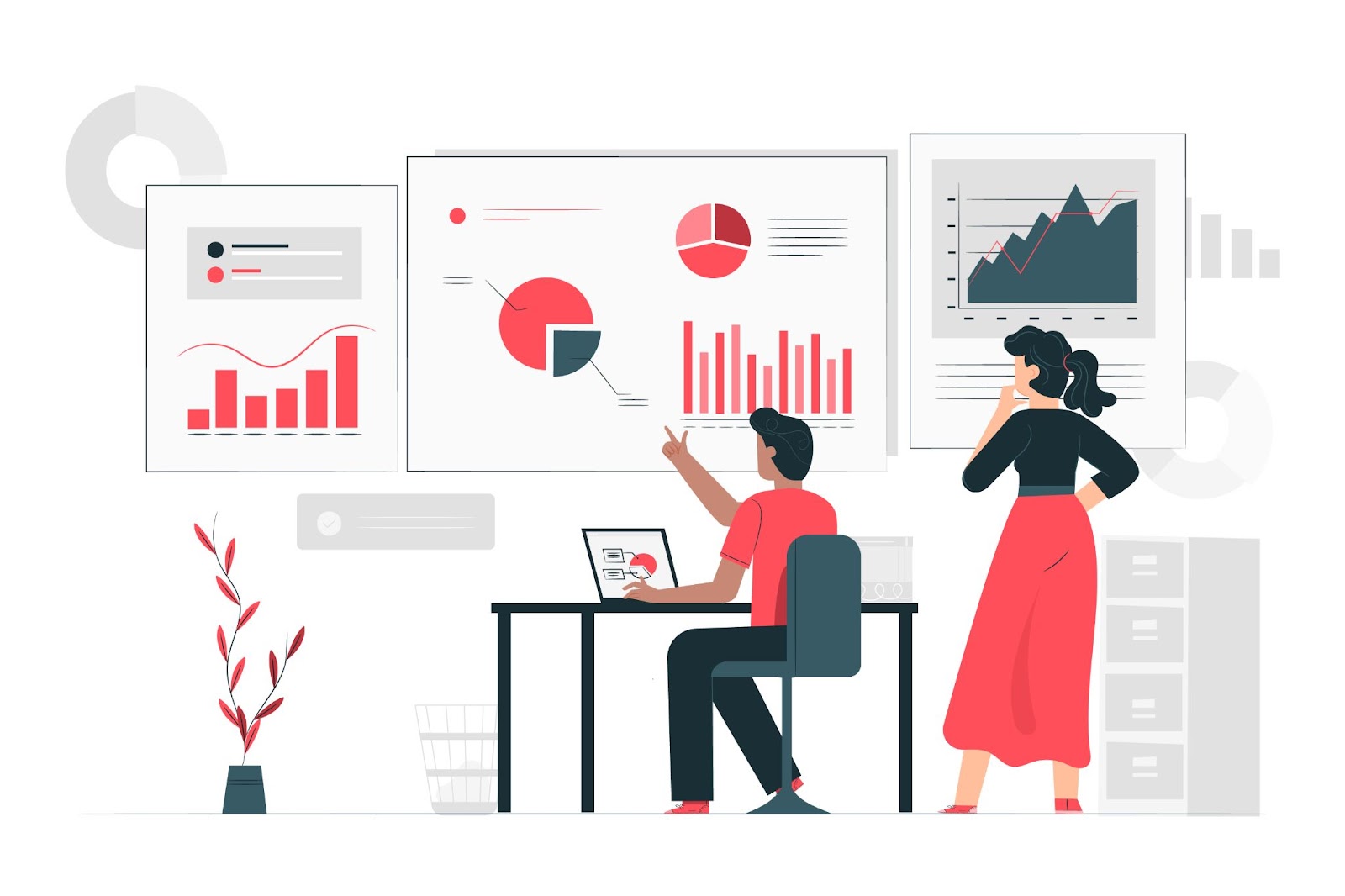
Optimizing the checkout process is crucial for improving conversion rates, and analytical tools can provide valuable insights into its efficiency.
Two key strategies are utilizing A/B testing and tracking key performance indicators (KPIs).
Utilizing A/B Testing
A/B testing is an essential tool for measuring and improving checkout efficiency.
By creating two or more versions of the checkout page and testing them with different user groups, businesses can determine which design elements, content, or layouts lead to higher conversion rates.
This method allows for data-driven decisions, helping identify the most effective strategies for reducing cart abandonment and enhancing the overall user experience.
Key Performance Indicators to Track
Monitoring specific KPIs is vital for evaluating checkout efficiency. Important metrics to track include conversion rate (the percentage of visitors who complete a purchase), cart abandonment rate (the percentage of users who leave without completing their purchase), and average order value (the average amount spent per transaction).
Additionally, tracking the time spent on the checkout page and the bounce rate can reveal potential friction points.
Analyzing these KPIs helps businesses identify areas for improvement, ensuring that the checkout process is as smooth and effective as possible.
Conclusion
In conclusion, optimizing your checkout pages is crucial for improving conversion rates and maximizing sales. This article has outlined several effective strategies, such as simplifying the checkout process, minimizing distractions, and building trust through clear communication.
By implementing these practices, you can create a smoother and more efficient checkout experience that reduces cart abandonment and encourages customers to complete their purchases. A well-optimized checkout page not only enhances user satisfaction but also contributes significantly to the overall success of your e-commerce business.